
Filosofia Type Study
Fall 2018
Research a typeface and find its personality. Design a book spread and corresponding video that are equally informative about the type's history as they are its personality.
Skills
Spread Design, Typesetting, Video/Motion Design
Tools
Adobe InDesign, Adobe After Effects
Collaborators
Individual
RESEARCH AND DISCOVERY
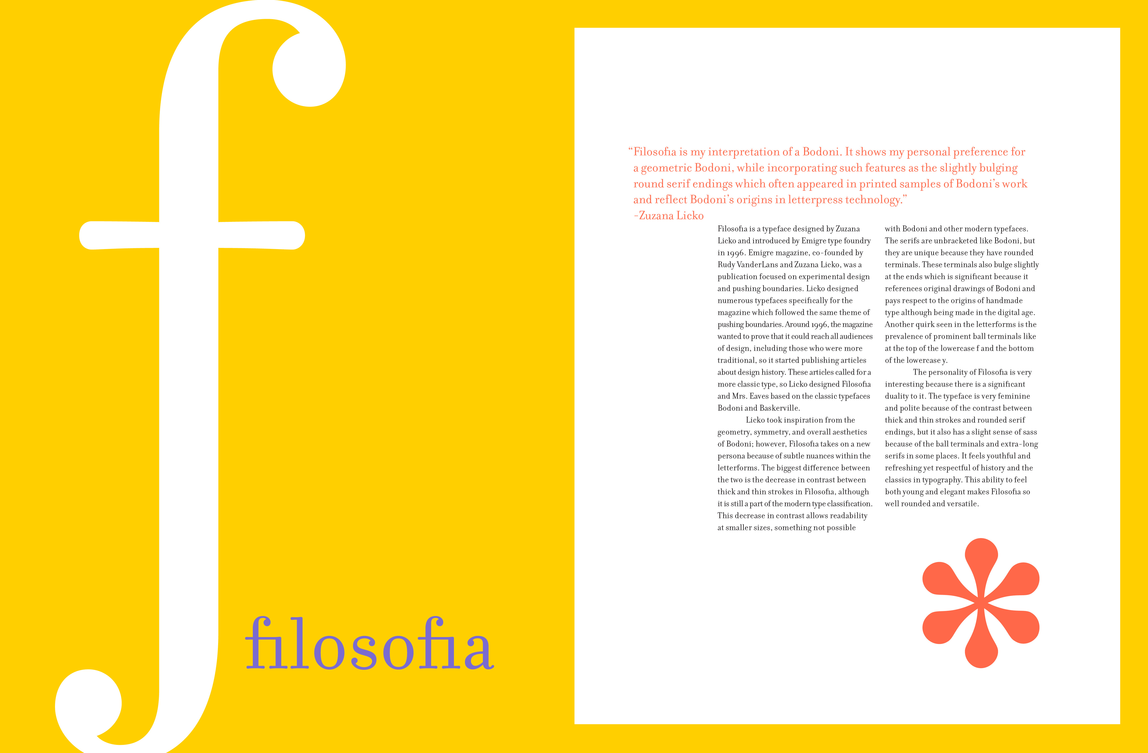
What color is it? Is it fast or slow? What does it sound like? What does it feel like? Which letterforms/glyphs represent the typeface as a whole? What makes it special? Is it feminine or masculine? What is its personality?
Here are some initial spreads I made while trying to answer these questions.


Typesetting Practice
How can I balance readability with beautiful counterforms?
As an experiment for myself, I wanted to learn how to properly justify type. I found that I really liked the process of typesetting because it was like a maze trying to find the right place for all of the words. Although I really love the way solid blocks of justified type look, they are not as readable as left-aligned text. With left-aligned text, I tried to learn how to adjust the rag to create beautiful counterforms that didn't distract from reading the actually text.


No items found.
COLOR STUDIES
In addition to exploring what colors to use, I pushed myself to explore different ratios of colors. I found that a color palette that shows proportions of colors tells a completely different story than one that shows each color equally.


No items found.
STORYBOARDING
What affordances do motion bring that print does not?
Here are some initial story boards where I explored sharing the personality of Filosofia through motion.


No items found.
No items found.
No items found.
No items found.
FINAL PROJECT

FINAL THOUGHTS
This project allowed me to explore a new typeface and introduced to me to my favorite type designer, Zuzana Licko. I learned a lot about the personality of type and finding character through both small details in letterforms and the overall flow of an entire paragraph of text. I really loved bringing this type to life through color and motion and utilizing the affordances of each.